Building an entrepreneurial product while advocating for the user and adhering to business goals
Client: ILM | Dec 2018 - Feb 2019
THE CLIENT
Our client discovered a market devoid of an easy, digital avenue of group gift-giving. Sure, we have group fundraising apps and store registeries, but there wasn’t an easy way to say “Hey, I really think so-and-so would like this. Who wants to help contribute to this gift?” That is exactly what motivated the entrepreneurial endeavor of the Thoughtful Pinch App, a social app that encourages and fosters the gift of giving small tokens of kindness. Thoughtful Pinch invites the user to post a small gift to someone they care about and encourages others to monetarily contribute to that gift. Once the gift goal is reached, the receiver can redeem the gift and the cycle continues.
THE CHALLENGE
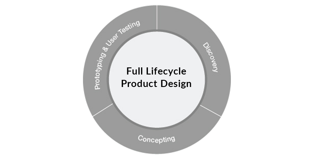
We met with the client when they had rudimentary visual and functionality guidelines. Ideas were raw and the client was still immersed in the discovery phase, so we were promptly brought on during the early stages of ideation. Utilizing our expertise in Full Lifecycle Product Design, our challenge was to work within an existing brand, define our audience and design a product that adhered to business goals and advocated for the user. Challenge accepted.
THE APPROACH
1. Discovery
DEFINING THE AUDIENCE
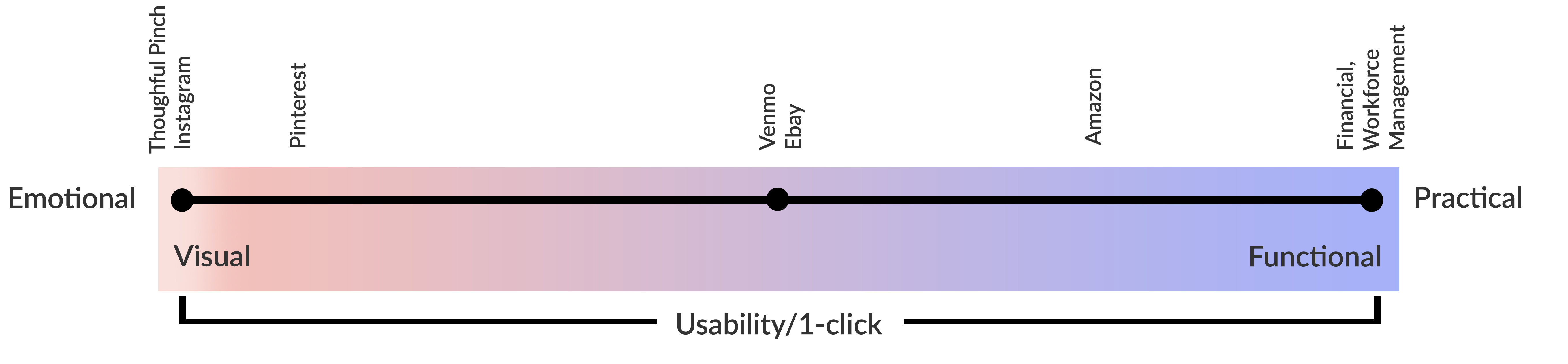
Who will use this product? What will they expect? How can we cater to their needs? These are some of the questions that helped us define our target market. We spent hours and hours understanding the “social” user, but our epiphany finally came when we figured out that we were designing a product for the “emotional" user. Unlike products and apps that are created for practical use, our product would be used emotionally. We realized our audience wanted to interact with an “experience”, feel good about contributing and be publically patted-on-the-back for their good deeds. And because our audience was the emotional user, social media would be the platform we would use to leverage FOMO (Fear Of Missing Out).
USER SCENARIOS
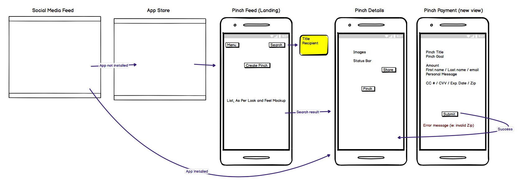
One of the obstacles we faced was determining how a user would navigate the App coming from a social link. Social platforms like Facebook were very restrictive with API useage and integration. We worked through many iterations of user scenarios and ultimately defined three ways of user entry into the app. 1) Direct 2) Facebook link with app downloaded 3) Facebook link without app downloaded. However, we still faced the challenge of entry #3. How were we going to direct the user to a specific app landing page when coming from a Facebook link without the app downloaded? We resolved this during the "concepting stage" below.
SUPPORTING THE BRAND
Our client had authored numerous blog posts under the blog name “Thoughful Pinch" about the idea of small gift-giving. This was before they decided that they wanted to turn their idea in an app. Since their audience already was familiar with their blog and brand, we decided to use their existing brand identity. However, their brand was not optimized for product use, especially on small screens like a mobile phone. Therefore, we enhanced their brand to adhere to mobile standards. We also created a color pallet that could be universally used.
Software used: Adobe Illustrator
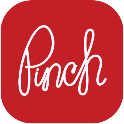
APP ICON PRIMARY
APP ICON SECONDARY
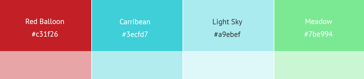
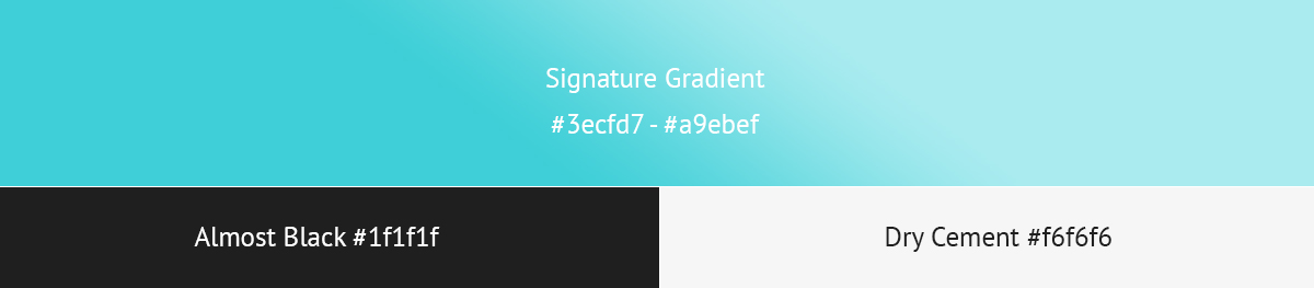
COLOR SYSTEM
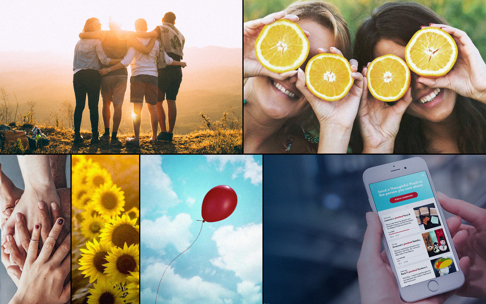
ART BOARD & PHOTOGRAPHY STYLE
2. Concepting
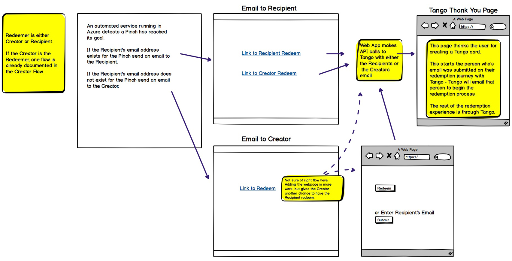
PROCESS FLOWS
One of our biggest discoveries during the process flow phase was uncovering some of the challenges with Login. Should we design the app utilizing traditional, immediate login methods or should we allow for delayed login? And, after doing several process flows we advocated for a delayed login. Our final decision brought us back to our audience. It's important for emotional users to empathize with the brand. Delayed login best acheives this. The user can explore without commitment.
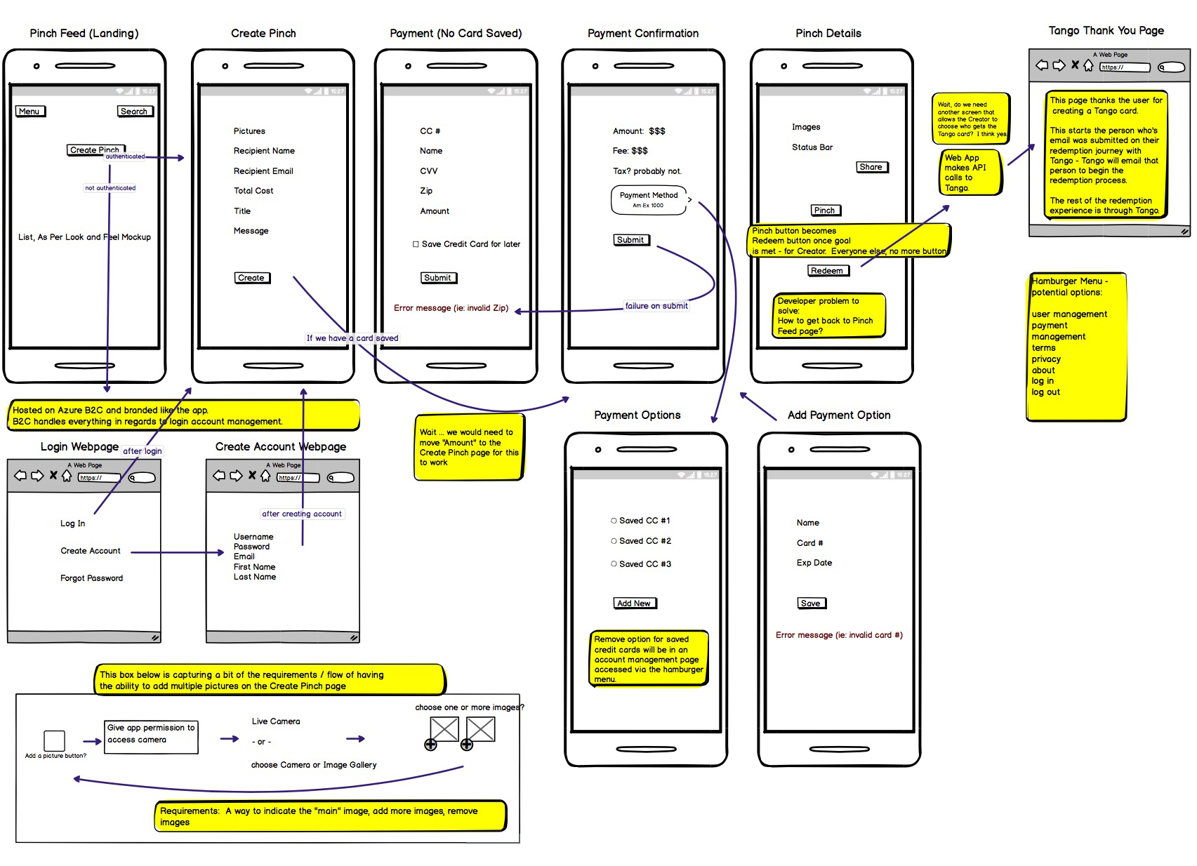
WIRE FRAMES
We sat down as a team through many interations and meetings, discussing the parameters and requirements of the App. Staying true to client guidelines, we created fast, simple wireframes that roughly illustrated the entire app experience. Once we received client approval, we moved quickly to the next phase.
Software used: Balsamiq
3. Prototyping and User Testing
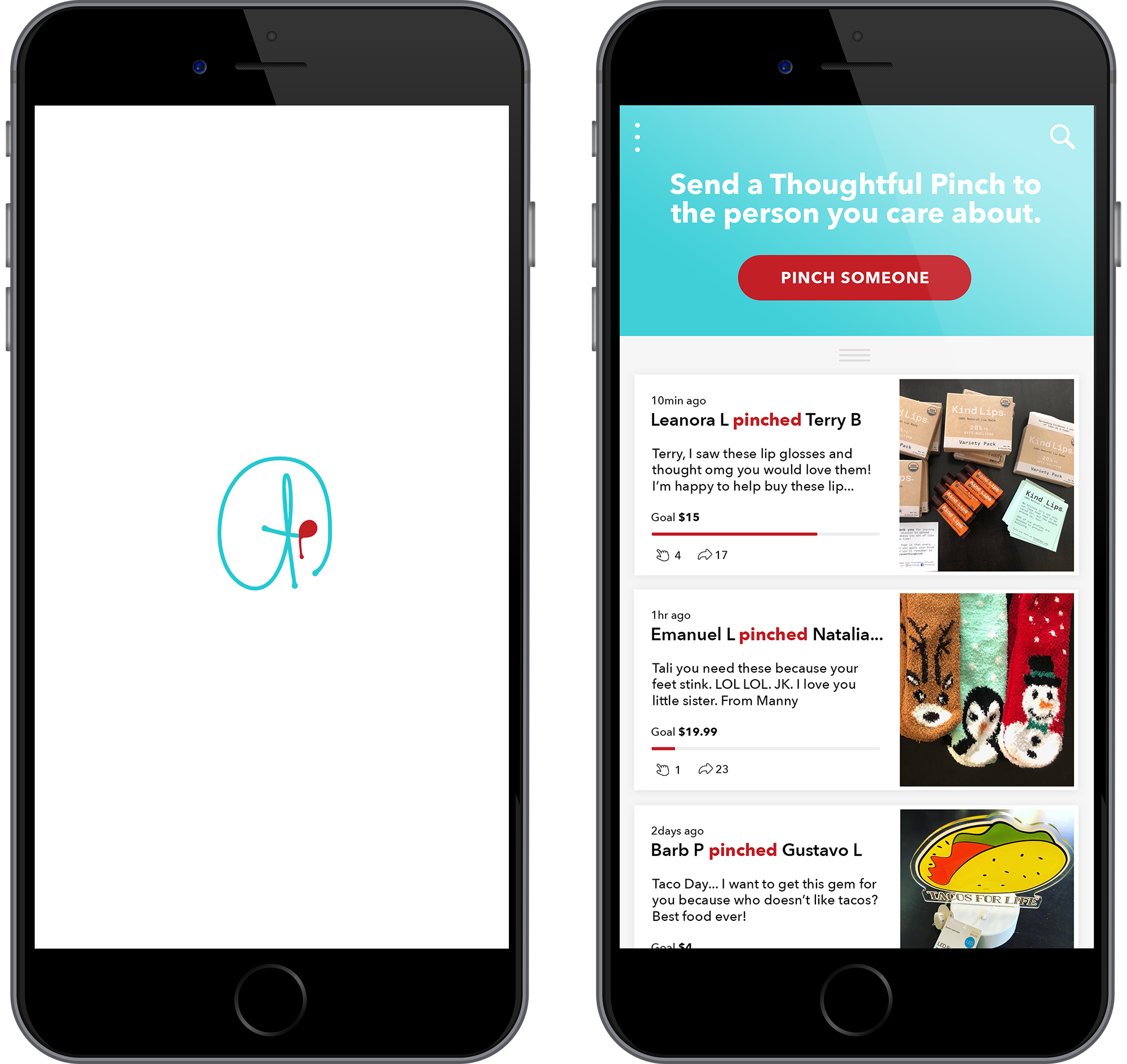
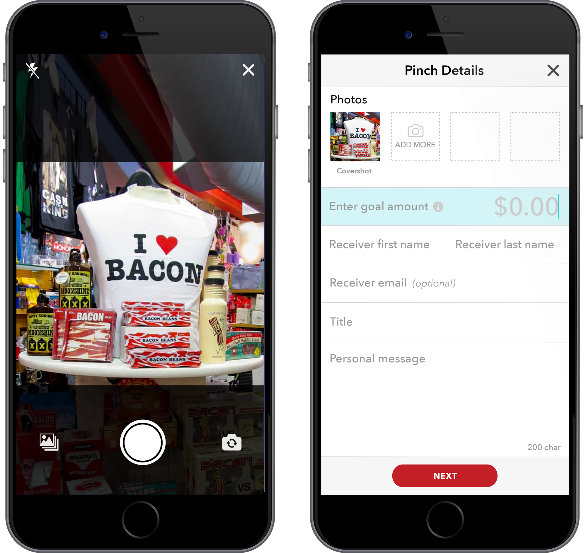
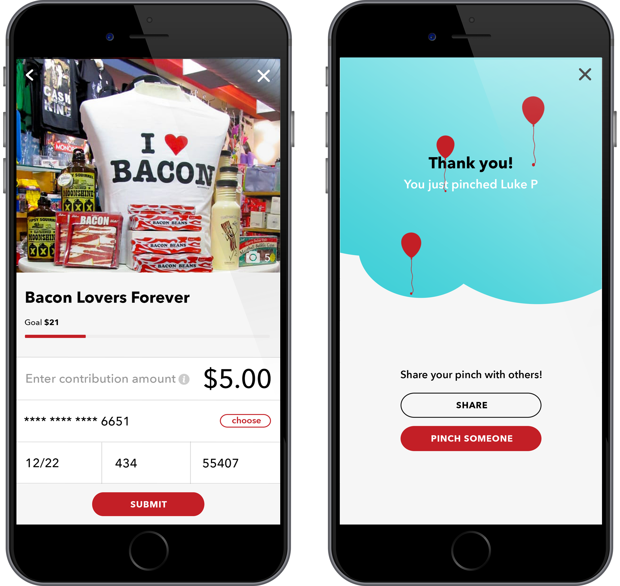
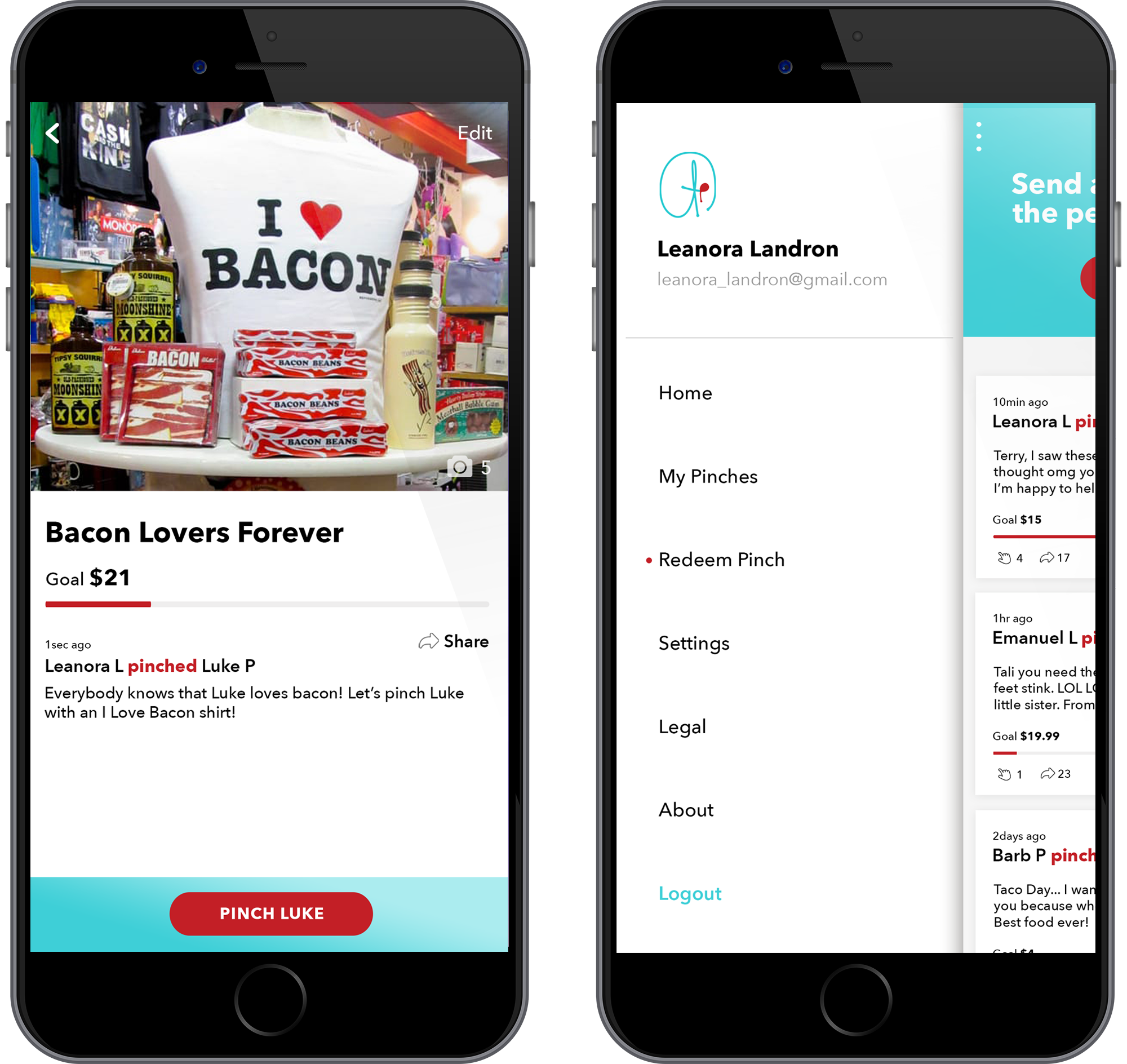
HIGH-FIDELITY PROTOTYPES
Using the wireframes as our guide, we designed high-fidelity prototypes that best reflected our vision. We kept the color pallet minimal and the screen design visually captivating. The high fidelity prototypes served many purposes and were a very important step within the process. First and foremost, they served as a testing ground before we moved the App into development. We can test our product with a small target audience and make adjustments before coding takes place. Secondly, it excited the client. The client can visualize the product and make key decisions that may have been lingering. And third, these prototypes, along with dev notes and annotation, served as a road map for the development team.
Software used: Adobe Photoshop, Adobe XD, Sketch and Invision
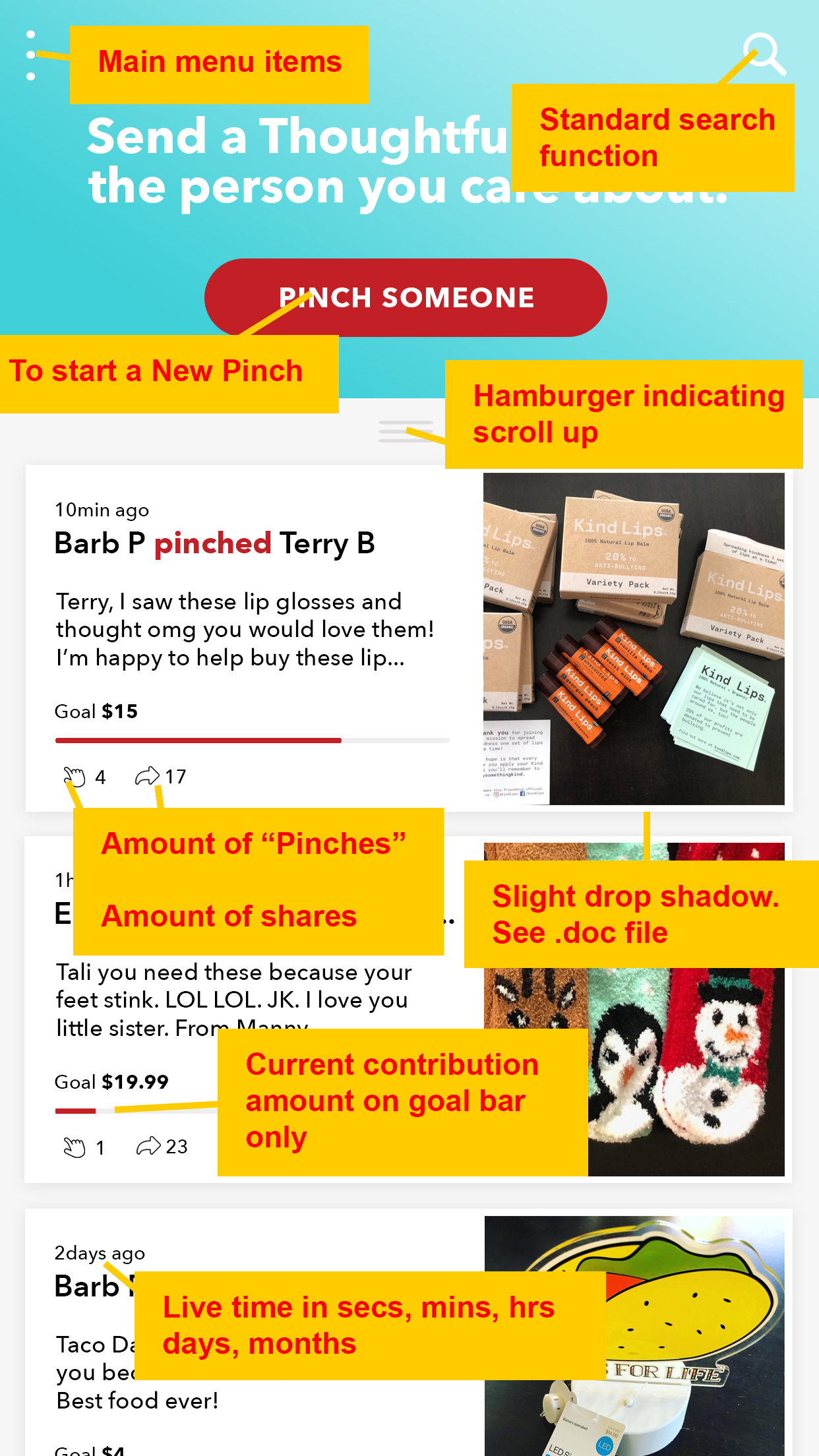
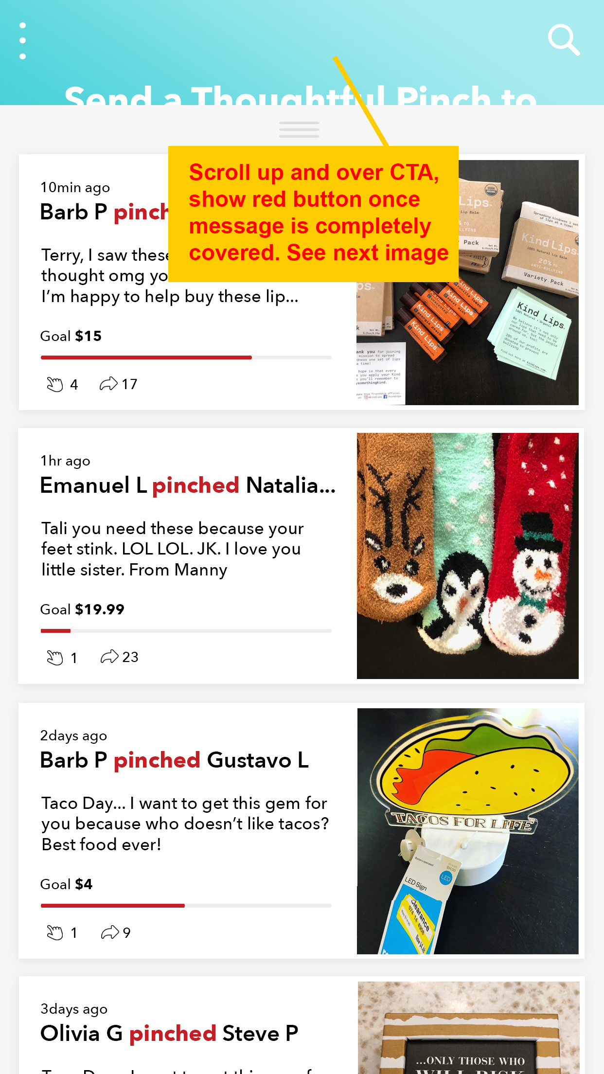
TESTING & HUERISTIC EVALUATION
After we successfully tested our prototype with a small group of users, we did a basic hueristic evaluation. A heuristic evaluation is a reliable method of identifying both major and minor usability problems within an App interface. We combed through our prototypes, looked for design flaws and rated them on a scale from 1-10. (Severity ratings are a combination of frequency, impact, and persistence.) By using this evaluation, we caught very minor inconistancy issues which we were able to fix immediately. Although we did not find any major issues during this process, it’s always good practice to include a heuristic evaluation early before the defects becomes too costly to fix.
Software used: Invision

PRODUCT DEVELOPMENT
PRODUCT DEVELOPMENT
We integrated our UX/UI design team with our client's’ dev team the second the project started in order to deliver results with tight deadlines. We relied on Agile methodologies in order to keep our designers and their developers close together during production.
The App was developed as a Semi-Native App for all platforms using Xamrin Framework
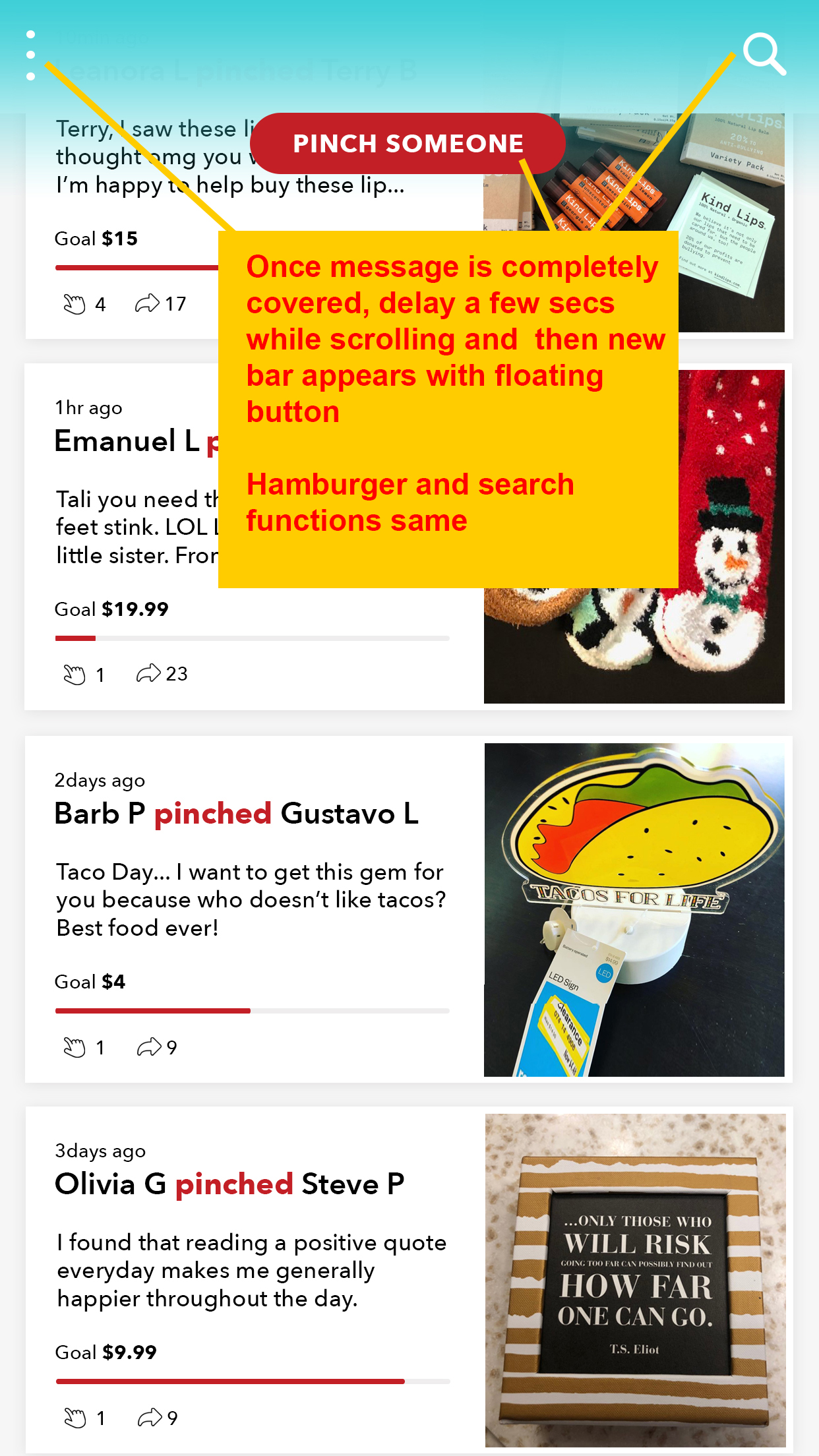
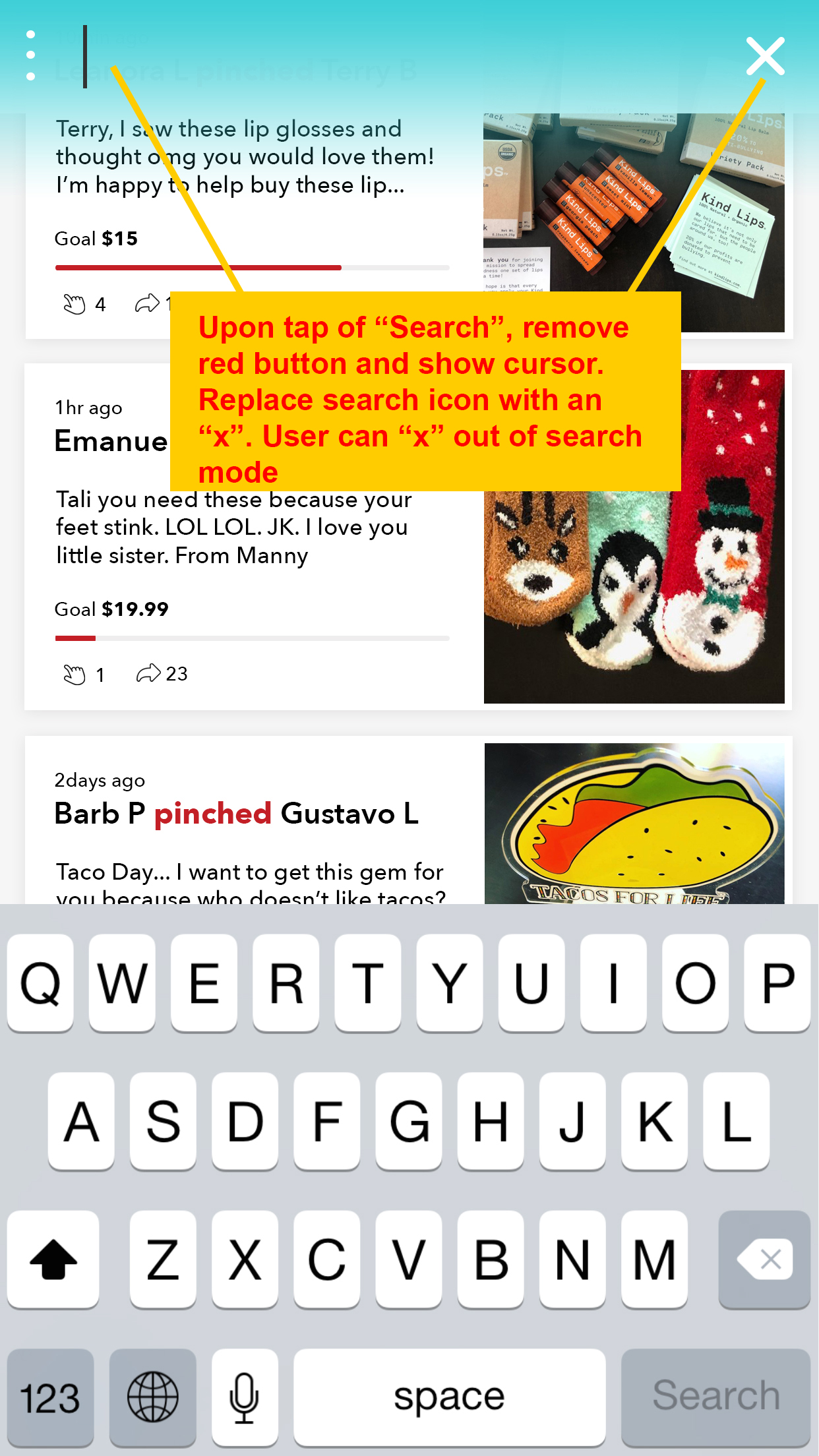
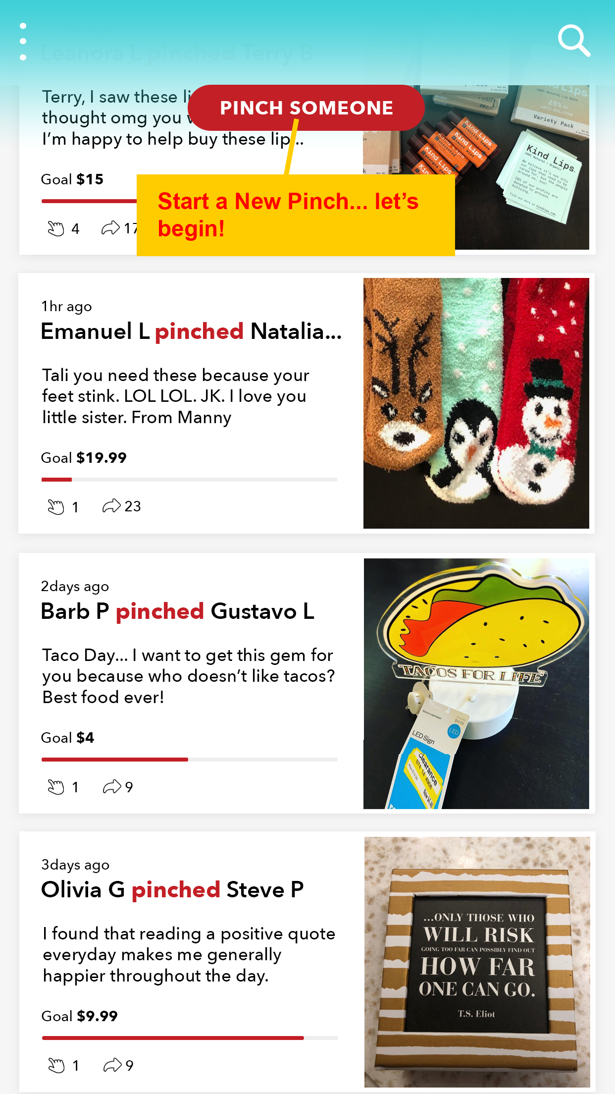
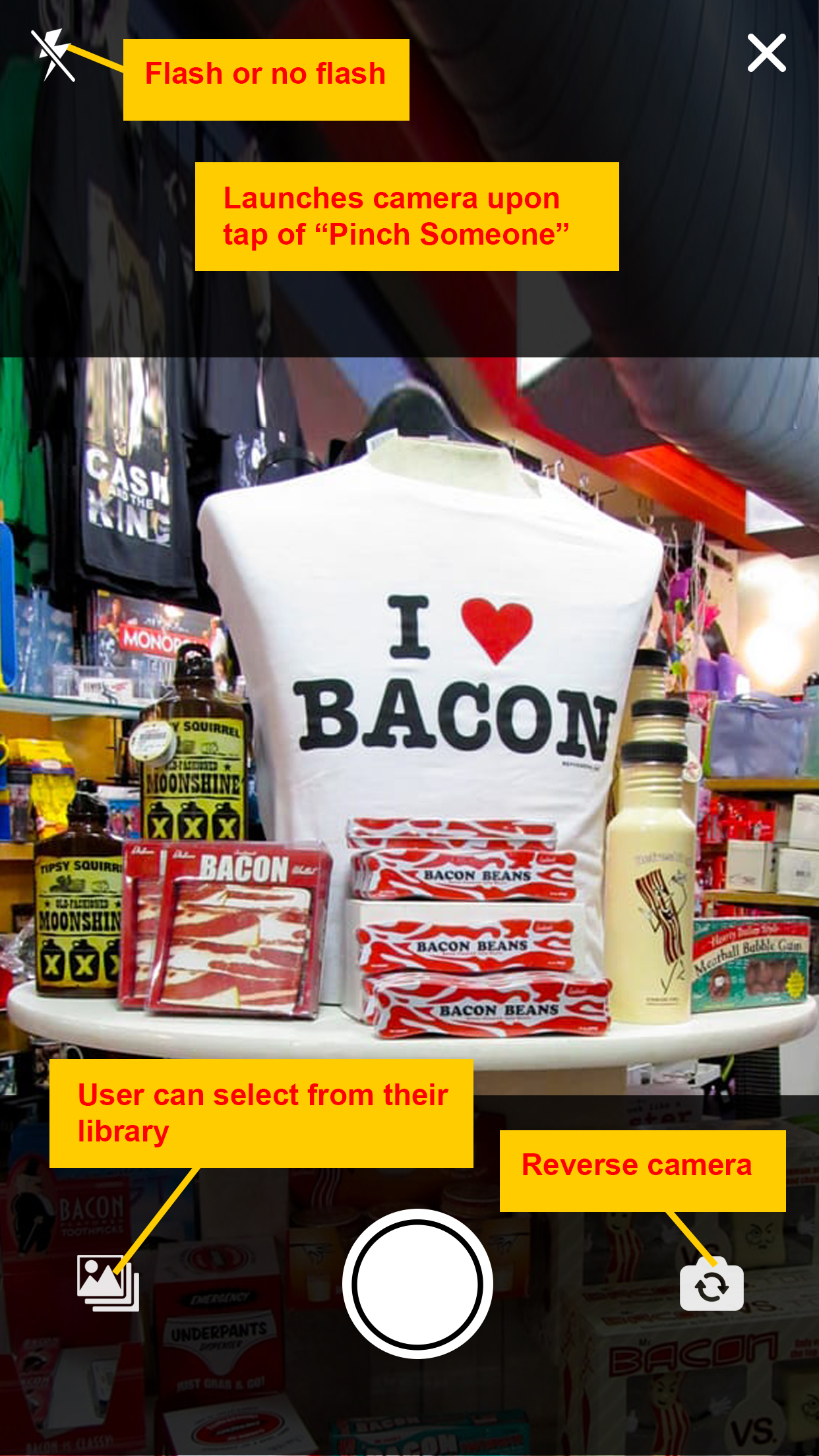
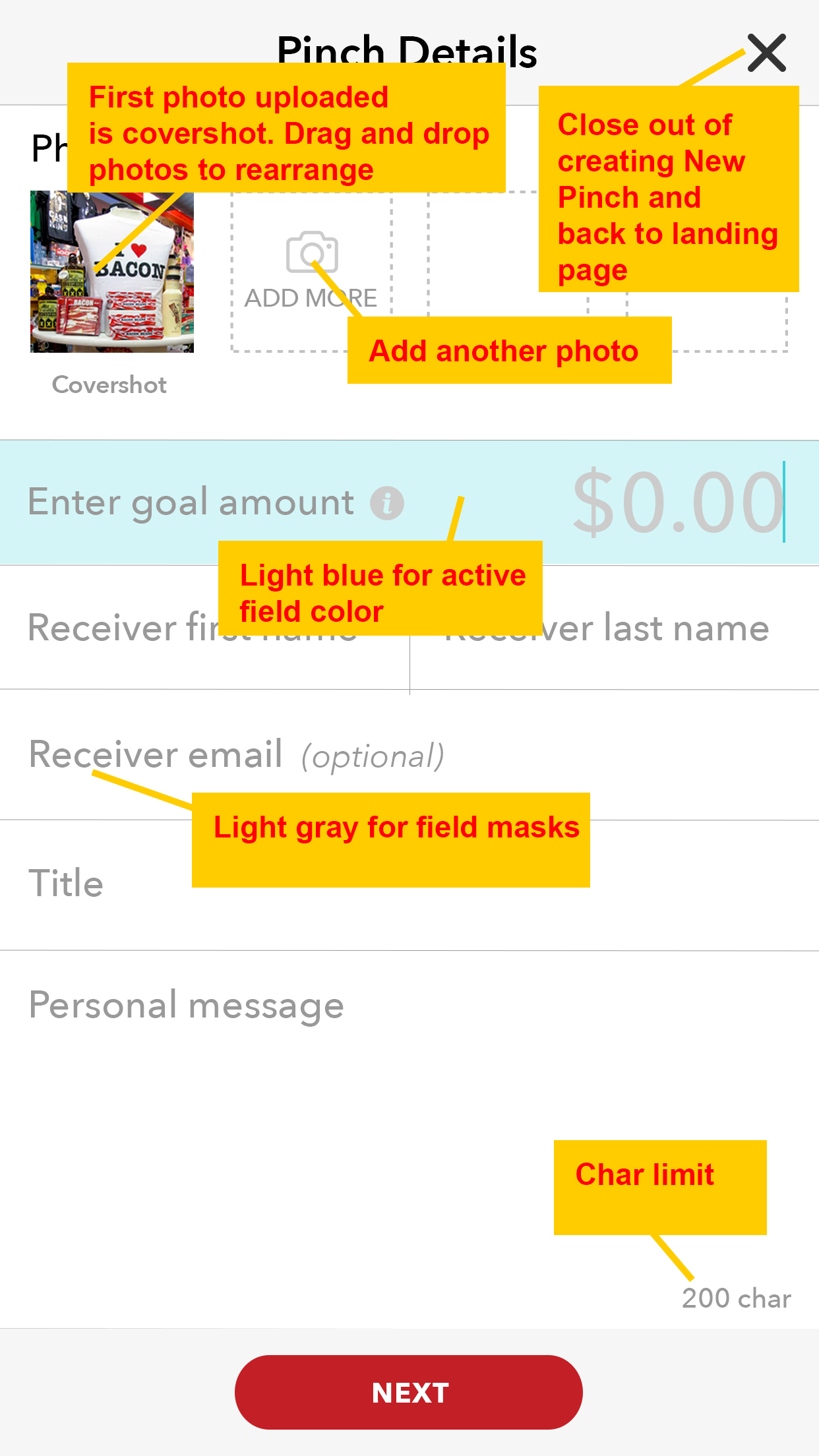
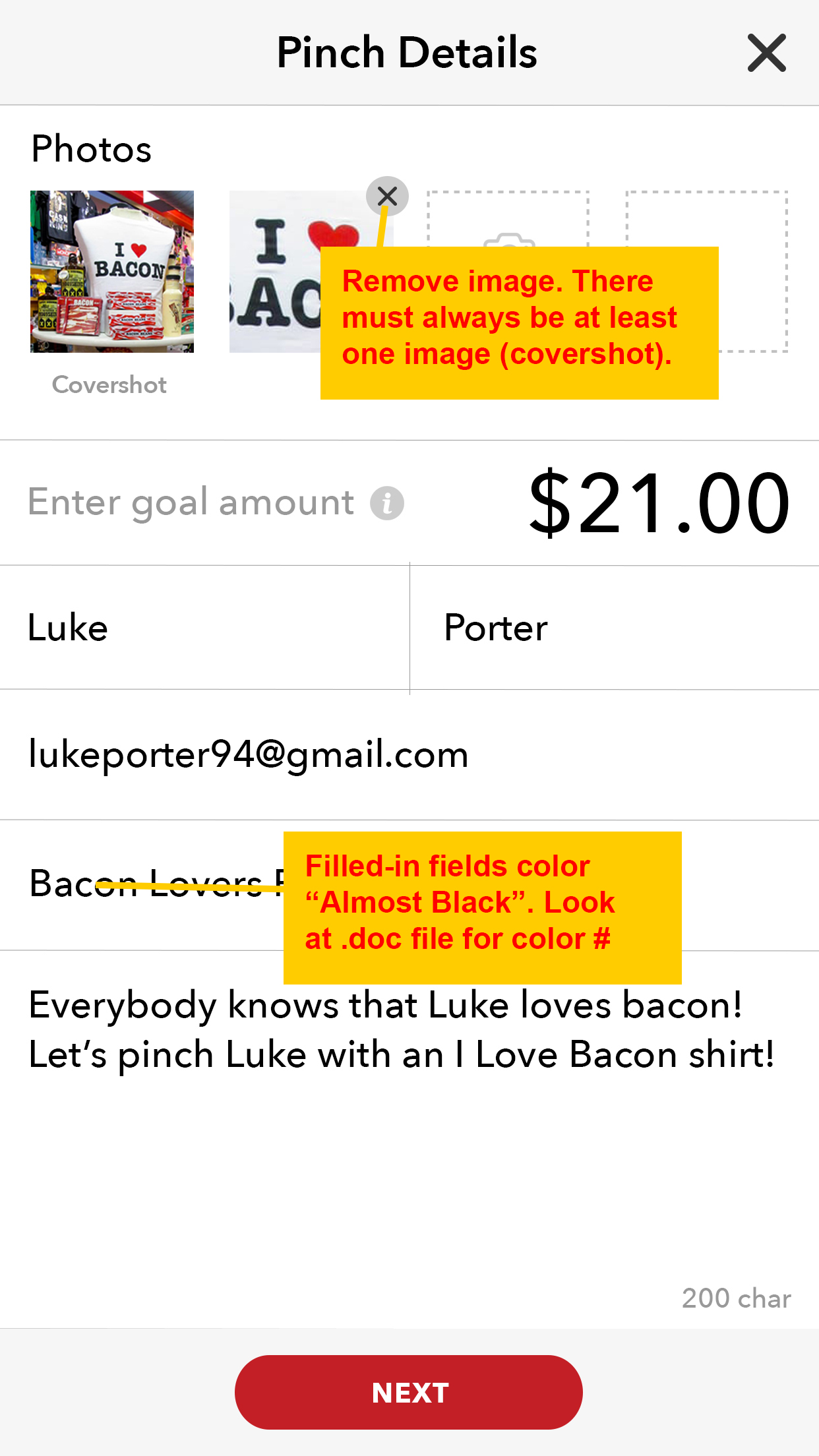
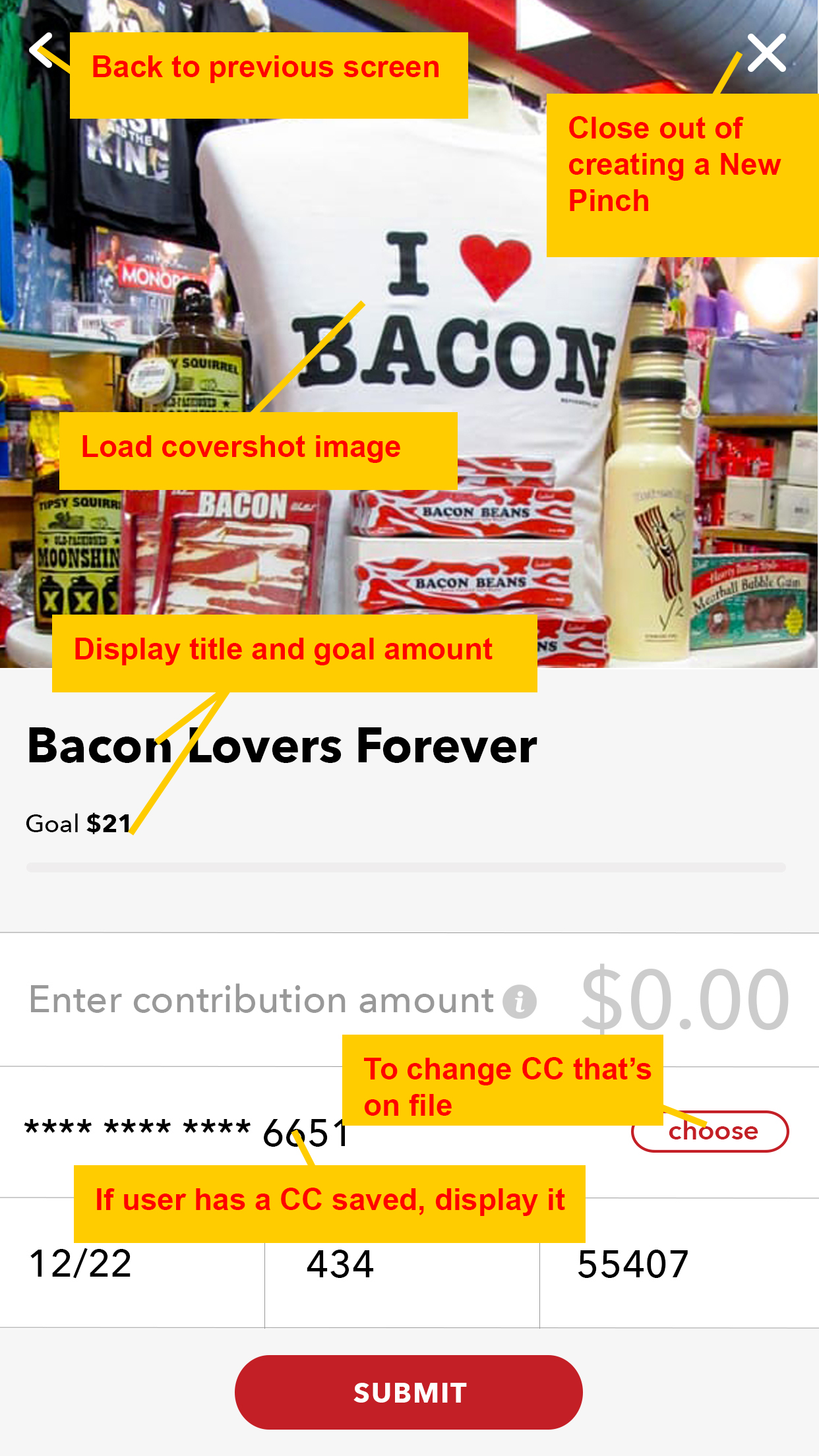
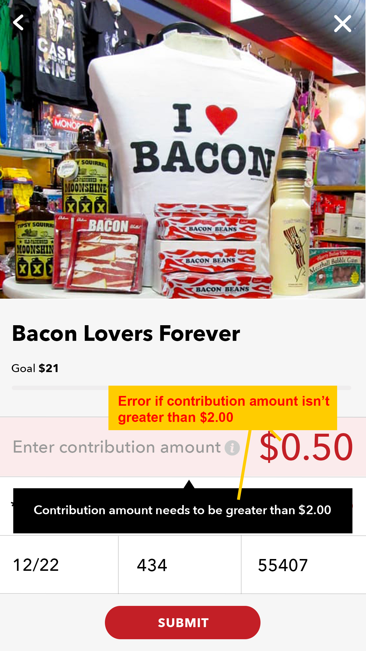
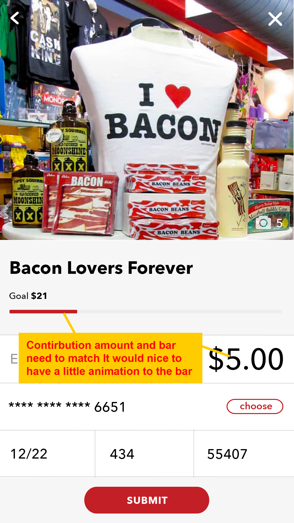
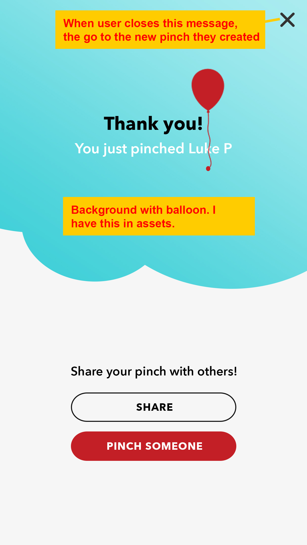
DEV NOTES
The app developers were implementing more than 50 Thoughtfull Pinch mockups in a row, so it was easy for them to overlook small design nuances like increased letter-spacing, light gray backgrounds or custom margins. Those discrepancies shouldn’t be left unnoticed, so the last step was to review the implementation of our designs and we provided several documents explaining what could be improved and where the execution didn’t align with the initial design.
THE RESULTS
After successfully completing the MVP (Minimum Viable Product), we are excited to see how early adopters menuevor through the App and we look forward to real market feedback.
We are also anticipating how new features can be incorporated into the app. We already started a feature list and can’t wait to begin rolling them out.
Lastly, this was a big win for our client. They were completely enammored with how well we were able to take their vision and business goals and turn it into an elegant, deliverable product.
We’d love to partner with you.
If you have an idea or a project on the table, let’s talk.
CONTACT US
We are based in Fort Worth, TX | CAREER OPPORTUNITIES
WebCandy Interactive LLC ©2021. All Rights Reserved.